
Behind the Scenes: creating the Escape Velocity data visualization series for Vox
Solarpunk data visuals that show clean energy's unstoppable progress
When Vox's art director Paige Vickers reached out about creating data visualizations for their "Escape Velocity" series, our founder Gabrielle knew this wasn't going to be your typical chart project. The premise was ridiculously compelling: showing how the clean energy transition is happening at such speed and scale that it can't be stopped, even by administrations openly hostile to climate action.
"The way you approach visualizing data using integrated photography is so compelling and would really add a lot to this story!" she wrote.
The timeline was tight, about a month to create 10 illustrated charts plus 4 hero illustrations, from initial concept to final delivery.
But we couldn't say no, how often do you get carte blanche to develop a unique visual language to express climate good news backed by data?
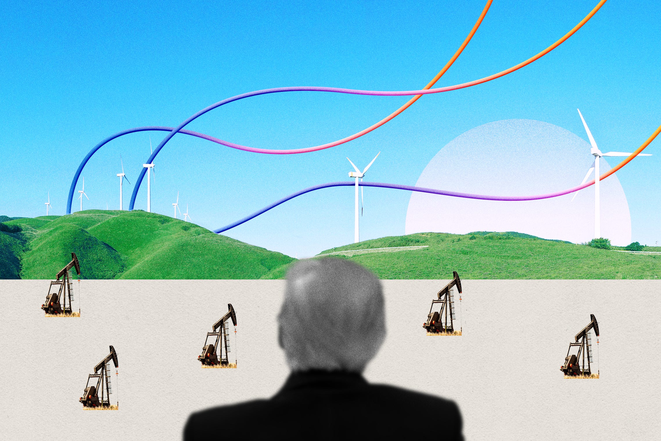
 from 1980 to 2024 where wind capacity has dramatically increased 23x over two decades. The line is embedded in a landscape of green hills with wind turbines, showing minimal growth until 2000, then accelerating rapidly in 2015 to reach 151 GW by November 2024.")
Not another doomsday visual
We knew immediately we didn't want these charts to feel clinical or apocalyptic. The climate conversation desperately needs a visual language that isn't all melting ice caps and smoke stacks (we’ve done a bunch of those).
Enter Solarpunk: the secret weapon for this project.
Unlike its cousin Steampunk, which looks backward with Victorian-era brass and gears, Solarpunk is forward-looking and hopeful. It envisions a world where advanced technology and nature coexist harmoniously, a perfect visual metaphor for the clean energy transition.

So with that in mind, we built a creative direction around:
Rich, bright colors inspired by dawns - Pinks, lavenders, teals and yellows that feel both natural and future-oriented
Real American landscapes - Wind farms on rolling hills, solar panels in deserts, geothermal sites in national parks
Futuristic-looking charts that interacts with landscapes - lines that cast shadows on hillsides and bars that rise from the earth…

And then there was the typography.
We chose Instrument Serif, which carries this warm 1970s Apple advertising vibe. And we made it big.
Why?
Because it's the same font currently used on the White House website, with big bold capitals screaming "AMERICA IS BACK." Using it to present climate progress data felt like the perfect ironic twist. (Shoutout to Paige who was down with this petty design choice).

The Hunt for Visual Magic
Each visualization started with simple data questions: What's the key story here? What's the best chart type to show it? What title and annotations will make this instantly clear?
But the real art came in finding the right photographs. This was honestly the hardest part of the entire project. In fact, it is almost always the hard part of collage data visualizations.
Sometimes we'd download dozens of images before finding the right one (and many WIFI crashes). We'd transform brown landscapes into lush green hills, adjust colors to match our palette, and add textures and grain for warmth.
In Photoshop, each chart had dozens of meticulously named layers.
Want to see the full behind-the-scenes process? Watch our founder Gabrielle break down the entire visualization process on the Elevate Dataviz Show.
Making data speak to everyone
One of our core beliefs is that data should tell a story anyone can understand. That means both in visual AND in language.
We ditched technical labels like "U.S. Wind Energy Capacity 1981-2024" in favor of narrative titles that says it all: "Since 2005, wind power has grown X times bigger."

Our annotations followed the same philosophy, adding contextual notes like "It all started in 1981 with 0 MW" that create entry points for everyday readers. This messaging approach was just as important as the visual style in transforming climate data from intimidating to inviting.
Deranged or Brilliant? The internet decides
The response was exactly what you'd expect when you mess with the conventions of data visualization: passionate opinions from both sides.
Critics on Twitter were... vocal.
"Vox just invented a new type of chart crime" wrote one.
"Who knows what other charts are being hidden in this?" complained another.
Someone even called the charts "deranged," which honestly made us laugh. If you have a minute from some hot Twitter debate, head here.

Meanwhile, supporters appreciated how our approach made climate data more emotionally resonant:
A non-designer tweeted “They are amazing. For once, I actually stopped and studied a graph instead of just glancing at it”
We got a shoutout from Andy Allen (who we admire) who said “Actually, these are great”
Those visuals were shared in an all-hands meetings in a dataviz company and the CEO said that they were a great reminder to think outside the box
This division highlights an important question: who is the audience? what would resonate with them? THIS is the crux of all our work.
Here, these charts weren't designed for data analysts who want pixel-perfect accuracy. They were created for people scrolling through social media who might otherwise skip past yet another climate change graph.
 now outnumber fossil fuel industry jobs (32.1M). The visualization features two diverging trend lines with clean energy employment in front of two works standing on a wind turbine.")
Visualizing hope without sacrificing facts
This project reinforced our belief that data visualization doesn't have to follow rigid conventions to be effective. Different audiences need different approaches.
When it comes to complex topics like climate change, creating an emotional connection to the data can be just as important as the precision of the visualization.
Sometimes making people simply stop think and look at the numbers is the whole point.
At Figures & Figures, we're proud to push these boundaries. Everyone is fighting for attention these days. So, sometimes you need to make charts that make people stop scrolling, even if it makes a few data purists clutch their pearls.
Plus, we got to reclaim Instrument Serif from the White House website.
That alone was worth it.

Let's Transform Your Climate Data
Are you working on climate initiatives that could benefit from data visualization that actually makes people care?
The clean energy transition is happening, but the story isn't being told in a way that resonates with the public. Traditional charts and graphs aren't cutting through the noise.
At Figures & Figures, we combine fearless creativity with scientific rigor to design climate information that clicks, sticks, and shifts minds.
Whether you're a climate nonprofit, clean energy company, research organization, or foundation, we can help transform your data into knowledge that sticks and ideas that mobilize.
→ Visit our website to see other examples of our work, or email us to start a conversation about your project.