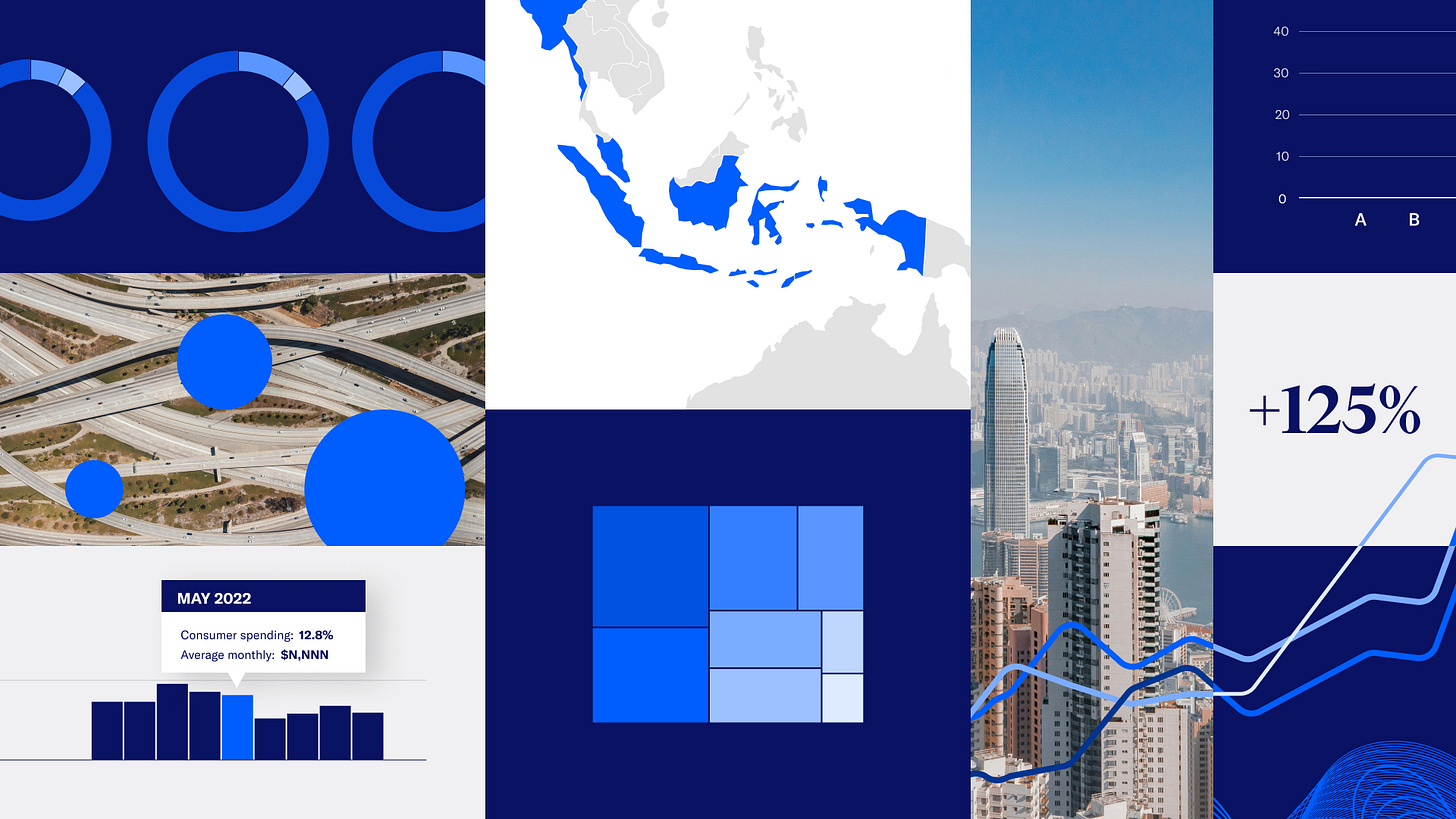
Clarity beyond color: creating data visualization guidelines that empower teams
How Moody's is gaining their audience trust with impactful data visualizations thanks to newly branded data visualization guidelines.
Most of the organizations we work with strive to be data-driven. But they measure this by looking at charts and dashboards. These are common identifiers because they're the artifacts we see. The truth is, how you communicate with data shapes every aspect of how your organization thinks, decides, and acts.
Below the surface
Whether it's through research that drives social change, or analytics that guide business decisions, organizations today are deeply invested in data. But while we perfect our methodologies and scrutinize our data quality, communication often remains an afterthought.
This oversight ripples through organizations in ways that most leaders never see. It's not just about inconsistent charts or confusing presentations (though these are certainly symptoms we’ve seen). It's about how these seemingly minor visual decisions shape your organization's ability to think clearly, act decisively, and build trust with your audience.
Think about your own organization for a moment:
How many hours do your analysts spend recreating charts that could be standardized?
How often do your meetings get derailed by debates about colors instead of conversations about insights?
Do your teams struggle to adapt complex visualizations for different channels?
These aren't just inefficiencies. They're symptoms of a deeper challenge: the lack of systematic thinking about how we share what we've learned.
From Guidelines to Growth: The Moody's Example
Moody's has been synonymous with financial risk assessment for over a century. As the company expanded beyond credit ratings into data analytics and AI-driven solutions, Moody's invested in a refreshed brand identity designed and developed by Interbrand. In 2024, they partnered with Infogr8 who invited us to help transform how they communicate with data.
While visual consistency mattered, the true goal was evolving how they communicate complex insights. The guidelines needed to reflect both their deep expertise and forward-looking vision.
Our journey began with an audit of over 270 charts and in-depth conversations with teams across Moody's. What emerged wasn't just a (large!) collection of visuals, it was a window into how the organization thought about and shared data. These insights shaped our approach: instead of simply standardizing colors and chart types, we created guidelines that translated Moody's values into everyday design decisions:
Clear became descriptive titles that guide readers.
Bold meant focusing on key insights rather than decorative elements.
Perceptive led to thoughtful use of color combined with greys to highlight important patterns.
Almost a year after launching the guidelines this week, we caught up with Moody's team. They describe the practical shift they went through post-guidelines: teams had refined the guidelines to work across different contexts while staying true to the core principles. For example, they adjusted typographic scales and styles suggested in the guidelines to exact specifications for print materials to ensure readability.
Most notably, teams now focus on strategic communication rather than debating design basics. Instead of simply shrinking existing charts for social media, they consider how people actually interact with data on different platforms. This means rethinking their approach based on context: visualizations in detailed reports can handle complexity, while social media requires focused messages that can be understood at a glance. When faced with requests that might compromise clarity (like cramming too many categories into a single chart) they have clear principles to guide their decisions. This shift in thinking, supported by the data visualization guidelines, helps them maintain Moody's analytical rigor while making their insights more accessible and engaging across all channels.
In our experience, shifts like these don’t just save time or reduce frustration, they empower teams to focus on what matters most: turning data into insights that drive action.
Bonus: they create awards-winning work.
So the real question isn’t whether your organization needs a systematic approach. It’s: What could your teams achieve with principles and tools that turn complexity into clarity, and insights into impact?
Starting Your Journey
We recommend most organizations to begin this transformation with a simple step: gathering examples of how their teams currently communicate with data:
Gather examples: Collect visualizations and datasets from recent reports, dashboards, presentations and social media... any data-based communications (just the last couple of months at first)
Look for patterns: recurring chart types, color usage, and formatting choices
Identify pain points: Where do teams spend the most time? What causes the most confusion?
Map your channels: List all the places where you share data visualizations
We'll dive deeper into each of these steps in our next newsletter, including a practical template to guide you through the process.
If this resonates with your team’s challenges—whether it’s teams debating chart colors instead of insights, struggling to adapt visuals across channels, or just feeling like your data isn’t driving the action it should—we’d love to hear from you. Share your biggest data communication hurdle at hello @ figuresfigures.com, and we’ll send you one actionable tip tailored to your situation. No pitch, just a perspective.

