Dataviz guidelines: starting with why
The first step of creating a style guide for data visualizations.
I started writing this newsletter a couple of weeks ago, talking about the first phase of making data visualization guidelines, the audit. But the audit isn’t the first step.
The first step is asking why.
Why would you need data visualization guidelines?
There are two compelling reasons to invest in data visualization guidelines:
Efficiency: guidelines eliminate guesswork, making the team swift and decisive in color, type, and chart choices.
Consistency: guidelines ensure uniformity in the execution of good design practices, forging a cohesive look across every product and platform.
One of those may be your why. These challenges are common in many organizations, from non-profits to massive corporations. Without guidance, design decisions are left to chance, often evident in the inconsistency across websites, print, and digital products.
And many hours wasted in design review meetings.
Yet, in my experience, there's one more argument, often overlooked but ever-present:
Brand Awareness.
Why brand awareness?
First, let’s rewind and talk about what a brand is.
A brand isn’t a logo. It isn’t a color palette. A brand is for an organization, what a reputation is for a person. It's how people perceive and understand what your organization stands for.
A brand is a person’s gut feeling about a product, service, or organization.
— Marty Neumeier
Recognition
Brand awareness begins with recognition. Can your audience recognize your work in a crowd of information?
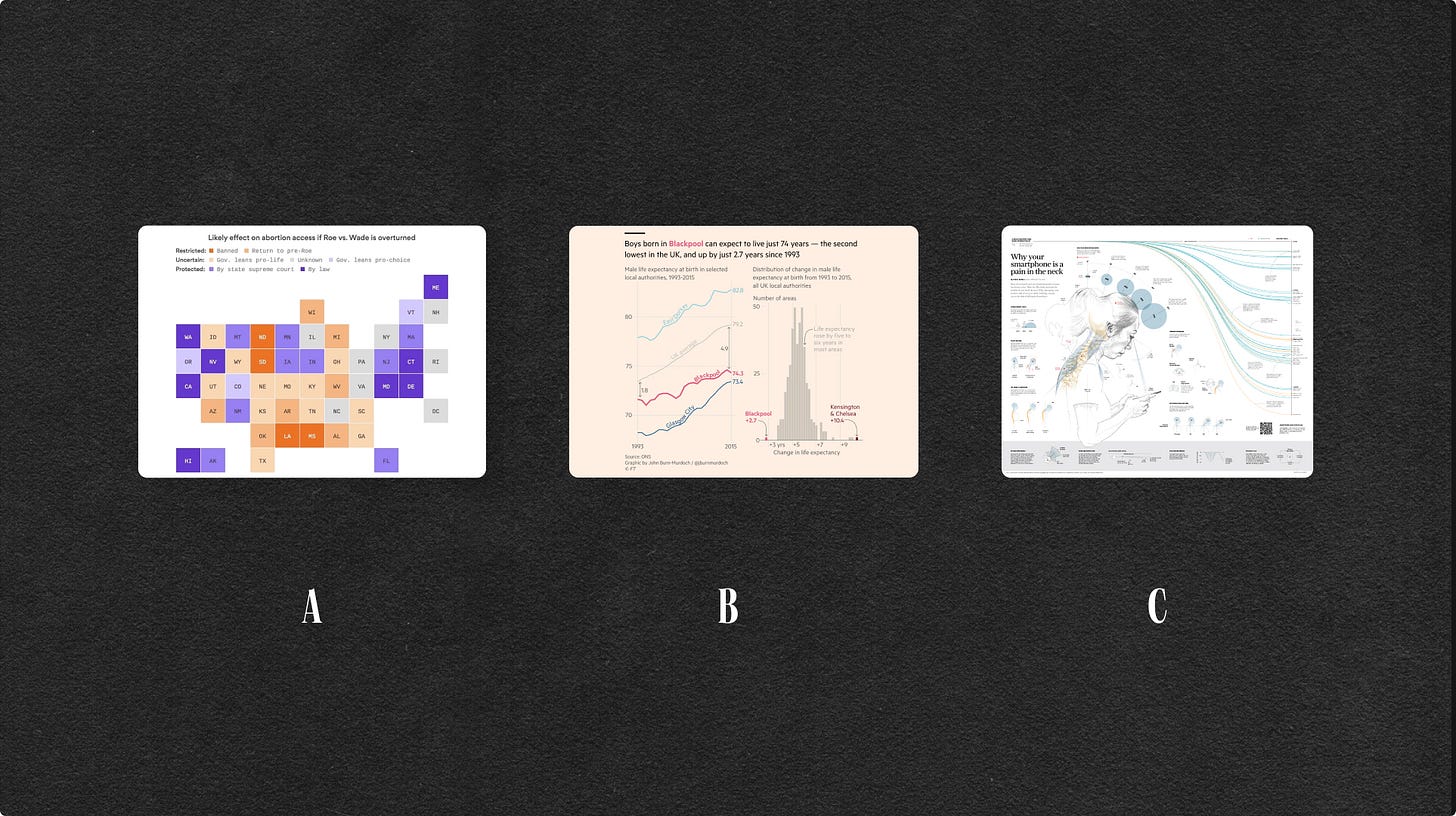
Take a look at those three charts. Can you guess the organization behind them?
I bet you can:
A is from the Axios
B. is from the Financial Times
C. is from the South China Morning Post
How could you tell? Well, just like logos on shirts, billboards, and tote bags that instantly convey an image, charts can serve as a distinctive signature for a brand. For some, they might stand out as the most widely shared visual assets: like in the field of public policy, where it’s not uncommon to screenshot and share a chart from a report *as-is* with a representative.
We live in an age where information is at our fingertips, but distinguishing between credible sources and noise has become increasingly challenging. Recognizable data visualizations can propel you above the chaos, establishing your organization as a committed data-driven leader.
Brand purpose
Brand awareness isn't just about being recognized; it's about tapping into the essence of your brand and the purpose driving your impact.
A year back at Pentagram, we teamed up with an organization aiming to fast-track social progress in the US. Their mission prioritizes a human-centered approach with a strong focus on ethics and inclusivity. For them, we created a data visualization language that seamlessly integrated with these core principles, just like it did the visual identity principles. We offered practical advice on executing ethical data visualization: covering language use, inclusive colors, and embracing transparency practices.
Your brand is a tale of vision and distinctive impact. Data visualization guidelines should make your information design work reflect this vision.
Gabby, who sincerely hopes to see more charts on tote bags one day
👋 Are you working on data visualization guidelines for your organization? Are you considering it and want to know more about the process? Reach out, I’m always happy to help.
Worth sharing
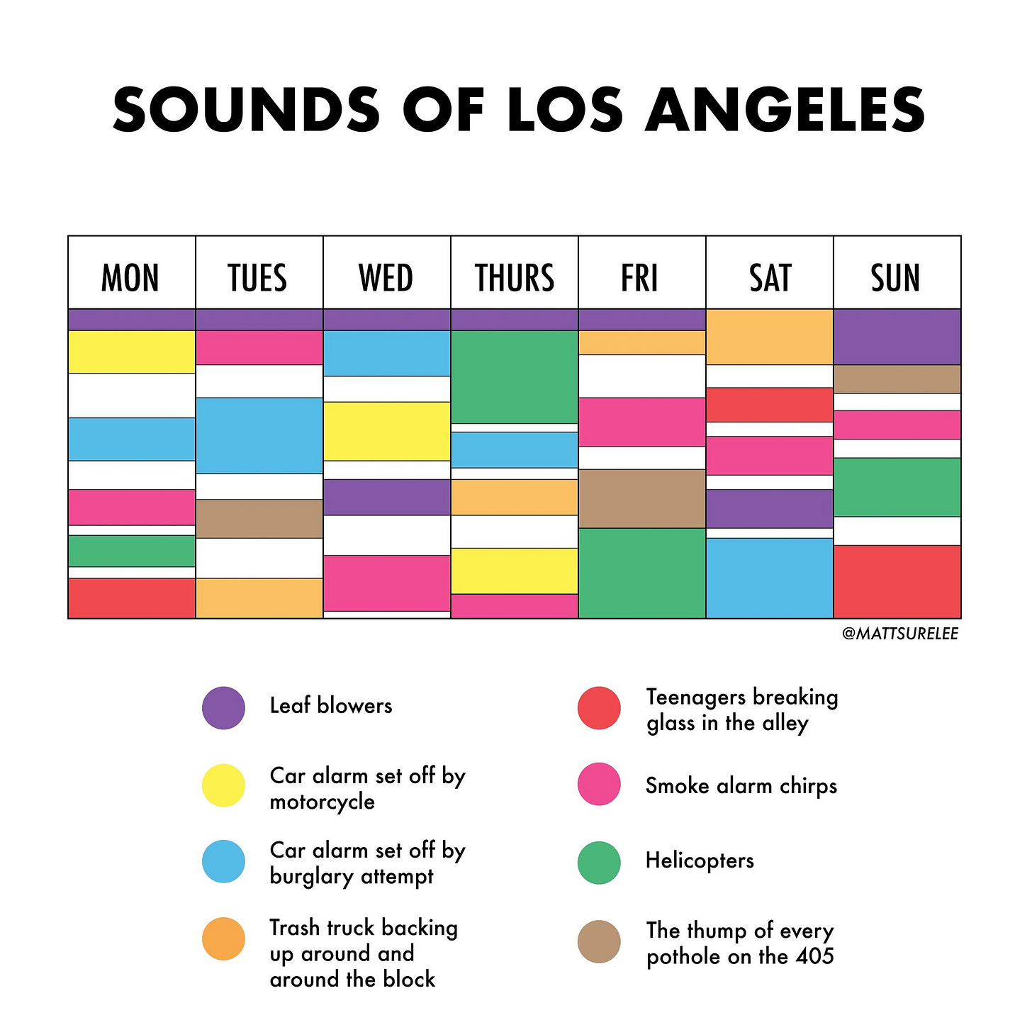
📊 Data Visualization of the month
A realistic data visualization.
Made by @mattsurelee
🎙️ Quote of the week
Respect, don't revere. Admire ideas, not people. They don't let you down.
— Sir John Hegarty in his Manifesto


