The election results didn't surprise me. I knew Trump would win.
My Californian friends had shifted from passion and outrage during the 2015 campaign to complete disengagement. Three months traversing the Midwest last year showed me a different view of North America. Where the rhythm of life beats differently outside the coastal bubbles of California or New York, the enthusiasm for the Republican candidate was tireless.
What baffled me wasn't the outcome, but how people ignored clear data that showed the predicted disastrous impact of Agenda 47 (closely related to Project 25) on those who are already struggling, freedom of speech, and our environment. Numbers that should have mattered, didn't. Facts that should have resonated were drowned in factless debates on gendered bathrooms, eaten dogs, and politicized hurricanes (remember “Sharpiegate”?).
Think about your last encounter with information. Did it come from a research-driven report? A detailed dashboard? Or was it something that bubbled up through your social feeds (yes, LinkedIn too), mentioned by friends, and referenced in memes and viral content, until it simply felt like something you'd always known?
We data practitioners believe in the power of well-crafted, accurate visualizations. We trust that if we present the facts clearly enough, truth will prevail. But we're using obsolete tools in a transformed landscape.
Nathan Heller eloquently describes this phenomenon in the New Yorker recently:
Trump seemed to think that much of the voting public couldn't be bothered with details—couldn't be bothered to fact-check, or deal with fact checkers. [...] Detail, even when it's available, doesn't travel widely after all. Big, sloppy notions do. […]
Planting ideas this way isn't argument, and it's not emotional persuasion. It's about seeding the ambience of information, throwing facts and fake facts alike into an environment of low attention, with the confidence that, like minnows released individually into a pond, they will eventually school and spawn.
The election result emphasizes how our relationship with information has fundamentally transformed. It no longer flows from expert to audience in neat lines, from precise data charts buried into PDFs to institutional voices sharing it with authority to targeted audiences.
Now, information spreads like rumors crystallizing into assumed truth. From YouTube influencers to podcast discussions, to our social media feeds, and back to our dinner tables, the cycle continues.
For those of us committed to data-driven change, this poses a provoking question: How do we create visual, data-driven messages that can survive – and thrive – in this “ambiance of information” while preserving their essential truth?
We can no longer treat data visualization as isolated evidence.
Our visualizations need to support broader narratives. They need to be modular pieces that can be adapted and shared across various platforms to ensure a consistent message.
The future of data visualization is not about perfecting the most precise chart for every application; it is about creating visual shortcuts—entry points that spark deeper conversations.
Gabrielle
Worth Sharing
Californian sunsets
There’s something really special about sunsets here in Southern California during winter. I haven’t been able to go to the beach as much as I usually do but I still see them from my neighborhood while I run.
Data Piece of the Month
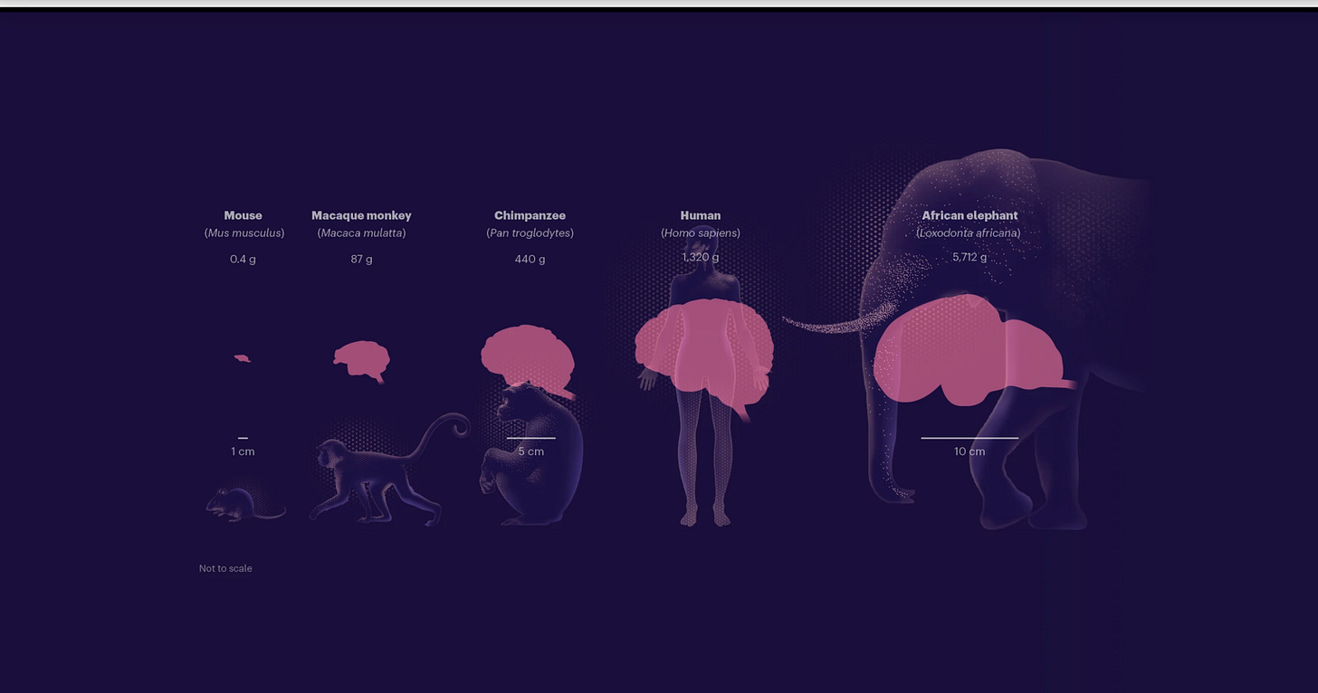
As a former biologist, I loved this scrollytelling piece in Nature. Beautiful illustration, smart story and some cool datavizs.
Something you might want to participate in:
I wanted to share my thoughts because so many talented individuals are questioning their abilities, or even reconsidering their entire careers.
The market's tough right now, and we're all feeling it. Instead of letting these moments define us, let’s support each other and plan ahead!
- Valentina D’Efilipo


I enjoyed reading that, some really interesting points. One thought it prompted was when you quoted Nathan Heller ("Trump seemed to think that much of the voting public couldn't be bothered with details—couldn't be bothered to fact-check, or deal with fact checkers. [...] Detail, even when it's available, doesn't travel widely after all. Big, sloppy notions do. […]"). It made me think of a post that Enrico Bertini wrote on Substack a week or so ago (https://filwd.substack.com/p/titles-in-data-visualization-empirical) when he was alerting us to research on how people look at the titles of charts more than the actual content of charts. Looking at a chart's title and not the chart itself is a bit like not bothering with the details, not bothering to fact-check...
Interesting read, such a massive divide in perception between the population. As a non American giving my 2 cents, I think you are ignoring the disastrous performance of the Democrat party while in power. One adminstration put forth control, efficiency, prosperity, peace and stability. One party put forth incompetence, Wokism gone crazy, economic hardship, blatant deception in the ability of the president, judicial persecution of a political opponent, running a campaign on hatred of Trump rather than any actual policy, or so it seemed.
How any American could have much faith in the democrats to take the lead for another four years is beyond me and this played out in the election results. Pointing to data predicting the country would be better off with Kamala feels like grasping at straws. Though Trump's administration now has to put its money where its mouth is and quickly. (Hope this doesn't come across as abrasive, not meant so. As I said, I can't grasp the massive divide in perception between 'Left' and 'Conservative'. Perhaps the Democrats need to discard the extreme left that has seemingly captured the party.)