
Figma & Dataviz, Gabby's favorite updates (Part I).
A focus on the auto-layout function.

Before Figma, I had never been obsessed with a tool. The thing is, Figma isn’t made for data visualization. Just like Illustrator, probably one of the other most common design tools isn’t. It turns out, a software made as an “online whiteboard where everyone who builds products can collaborate” can turn into one of the most efficient tools for data visualization.
Product and web design are so close to some of the information design I create that Figma has become my all-in-one tool for most of my work - including for presentation design. The latest updates announced during Config made me jump out of my seat with excitement.
I figured, why not share with you why?
#1 Auto layout function
Okay, so if you’re not familiar with the auto-layout function yet, go check it out. This is THE function that saves us all 1,000+ hours of work.
*Illustrator, I love you but your Alignment function sucks*
The basics
Despite how incredible it is, the auto-layout function didn’t allow for fully responsive design, the way a flex box should. There was no stacking capability. This made it hard for any data design that relied on units stacking properly. Everything would get deformed (at best) upon resizing.
Don’t see when that’d be useful? Imagine creating a waffle chart, one of the charts I sneak in everywhere, like on the MethaneSat story.
The tool used to respond like this:
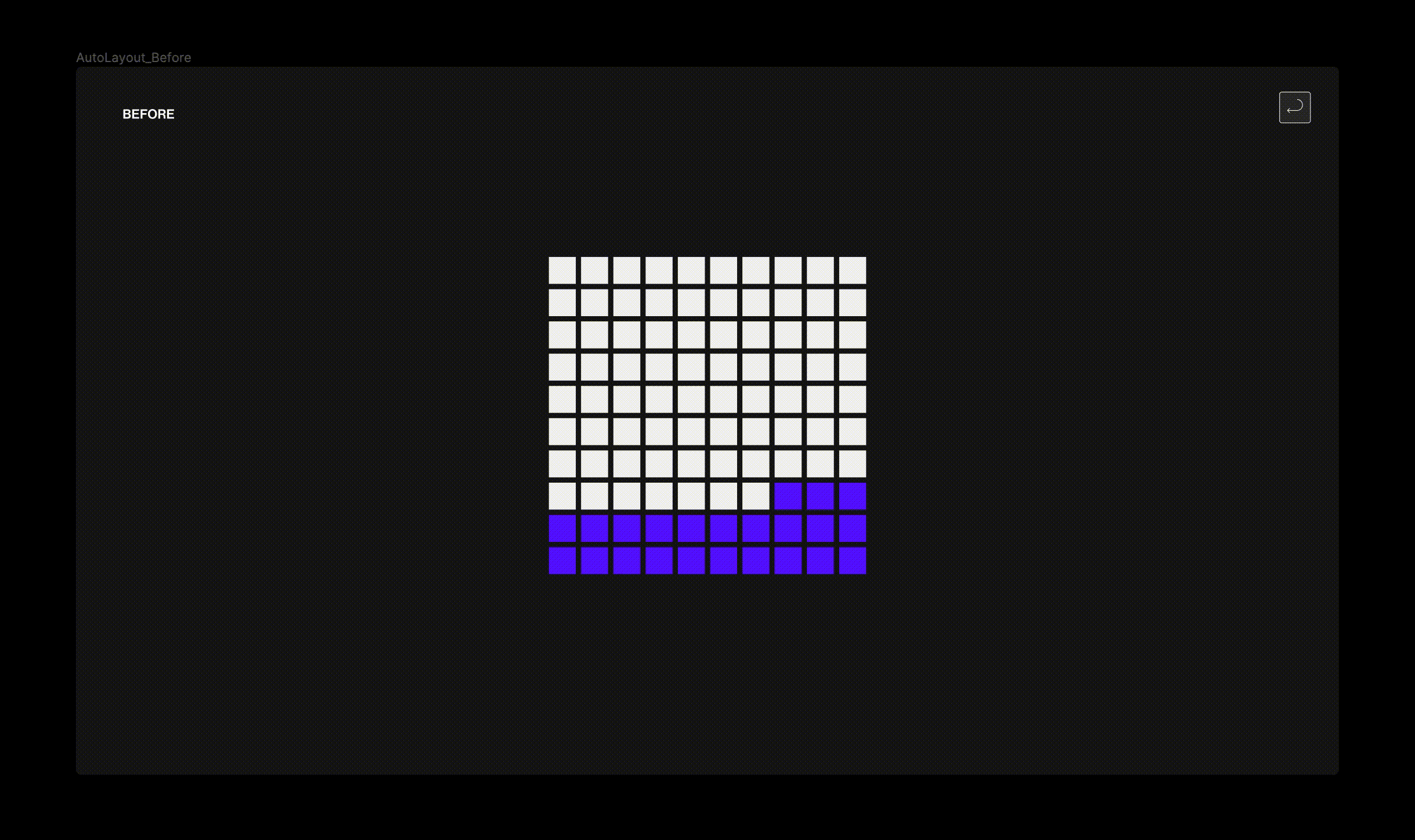
[ID: a waffle chart being resized horizontally, the square units lose their square shape and deform according to the width variations.]
And then, Figma came up with a wrapping function. Now, any unit could stack responsively to height and seize. *Game changer*.
[ID: a waffle chart being resized horizontally, the square units that make up the chart stack accordingly]
The design life-changing feature
Let’s say you’ve built a beautiful data story using multiples. You’ve laid it nicely on a page and then wonder… what happens if my multiples need to respond to the width of the screen?
Most likely, it’ll start looking like this:
[ID: a screen with four small thumbnails, each with a bar chart. The screen’s width is being resized and the thumbnails end up being out of view and cropped out]
Figma added an additional settings: the ability of adding a minimum and a maximum width and/or height to each elements.
This means I can decide how much an element can stretch in all direction and when should the elements start stacking.
And now, my designs can look like this:
[ID: a screen with four small thumnails, each with a bar chart. The screen’s width is being resized and the thumbnail stack vertically when the width becomes small]
Did you catch what is happening? This is real responsive design:
Grey containers: the grey container stretch until a certain size only, and when compressed, start stacking instead.
My bar charts are… responsive! Damn, my bars width slightly adapt to the width of the screen. Setting a minimum and maximum width prevent them from deforming.
Bonus: My chart’s subtitle is no longer becoming this non-legible-ultra-long sentence, it has a max-width too!
We no longer have to make a different frame for each breakpoints - and 639486 instructions that no dev is going to read - to ensure good responsiveness.
And that, Mesdames et Messieurs, is why I love Figma and am writing this absolutely not sponsored newsletter.
Stay tuned for Part II where we’ll be talking about colors, rounded corners and the magical variables.
“Democracy cannot survive this failure of the marketplace of ideas because it disables the formation of any shared ground where competing propositions can be tested against each other in the full gaze of the body politic as a whole” and more about the Infopocalypse.
True accessibility with tactile graphics and this incredible tactile “flatten the curve” chart.
OMG THIS AUTO WRAPPING IS INSANE. LOOK AT THAT. Holy shit. This is like hours of manual labour done in an instant. I love the video inclusion, so helpful as a visual! I feel like Figma is just like the wine of the Greek Gods for us wee mortal designers.
Any “Figma for Data Viz” online courses you recommend?