How to avoid Frankeinstein data designs
Setting up your creative projects the right way.
Recently, I was called upon by Gurman Bhatia to assist her talented team at Revisual.
The work was beautiful. But one of the designers had bumped into a creative direction challenge.
The problem
The designer presented several options to the client for fonts, color palettes, as well as UI elements look & feel. Most of those were variations within a certain style.
The client had expressed their preferences for each category. Yet, the designers found themselves grappling with uncertainty about how to harmoniously weave these elements together.
I call this the PPP for Piecemeal Preference Pitfall *and yes, I’m taking credit for this one!*
Let’s compare creative direction with choosing a hike for your weekly Sunday gathering.
A well-meaning friend offers to evaluate the different settings as follows:
Type of landscape: desertic along a runny path of water, canopy trail under the shadows of trees, or mixed landscape with flowery meadows and beautiful views.
Difficulty: low, medium, hard
Length: 3 hours, 1.5 hours, 30min
The group expresses their preferences for each criterion, and the final decision is based on the hike that meets the most popular choices.
The result? A 30-minute hike that begins in a picturesque meadow but quickly ascends a daunting mountain. And the views? You were too busy lying down and catching your breath to look at them.
In hindsight, everyone would have preferred the 3-hour journey through the shaded canopy on a level path. Next time, you’ll do a Sunday Funday brunch instead.
This scenario is akin to what designers often subject their clients to. They present choices in isolation, devoid of context. An exaggerated version might look like this:
”Here is font 1, font 2, font 3. Which one do you like?”
“Now here are 4 color palettes, which one resonates most with your audience?
While the individual choices may be sound, there's no guarantee that when combined, they'll strike the perfect balance of boldness and scientific-ness that your client seeks.
The solution
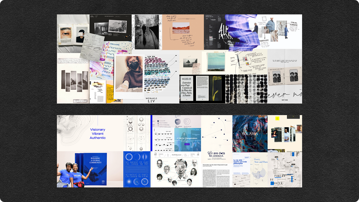
Stylescape.
It is an elevated mood board that artfully arranges your design choices and inspirational images, cohesively presenting them. It's a technique frequently employed in branding. If you're unfamiliar with the concept, I recommend watching this video.
Stylescapes allow us to assess how all the elements interact – not just colors and fonts, but also typographic hierarchy, space (white space versus busy), styling (textured, sketchy, or minimalist), depth (layered with shadows or flat), and more – within a single canvas. The beauty of stylescapes lies in their simplicity; they require minimal design work.

The result: one harmonious look and feel, leaving no room for ambiguity – for both the client and the designers.
If you want to offer choices to a client, craft several distinct stylescapes. Each one should be accompanied by a narrative that explains:
its raison d'être
the aspects of the brief it answers as well as how it balances some that may seem contrasting *the scienc-y but bold look & feel*
why it would be the optimal choice for the target audience.
For a more complex project, develop your stylescapes into examples of applications: how a header could look like, how one chart could carry the art direction. Offer a complete vision of where you could go.
Let them choose one direction, then refine it as needed.
Gabby, who loves Sunday Funday brunches
👋 Are you working on an evidence-based creative campaign for your organization? Reach out. Let’s explore strategies to utilize your data's full potential moving forward.
Worth sharing
Request of the week
Vote for two of the favorite projects I led at the Webby awards!
The Long Covid Data story in the New York times in the Best of Data Visualization Category
The American Opportunity Index in the Employment Category.
Datavizs of last century
The Chart Kills Fascist by RJ Andrews in his newsletter describes how charts played the major role during the Nuremberg trials.
Quote of the week
We can use the science and art of great storytelling to illustrate what it looks like to make meaningful change as part of a movement ecosystem. When we start to tell these types of stories, we avoid contributing to harmful narratives that make it impossible to change systems and cultural narratives.
Annie Neimand in How to Tell Real Stories About Impact


Thank you so much for this fantastic read!